Some feedback
Posted by PabloMc2 ·July 9, 2026 4:28pm
First - thanks Ste!
This looks like quite an undertaking and it's very much appreciated as Boardhost continues to creak and groan...
Other than the points already raised, my aging eyes are struggled to distinguish between "unread" (blue underline) and "unread" (green underline) once you get into the thread (it's fine at the top level - very clear)
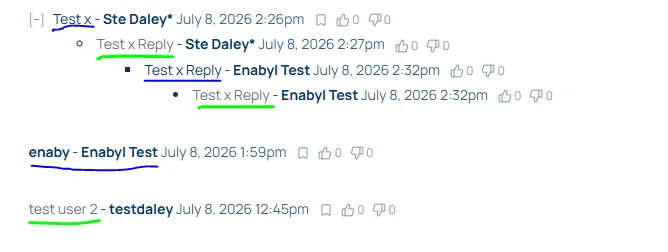 Compare and contrast with the old place, which I find much clearer:
 Other than - looks great to me!
(I think I will definitely need some emoticons though....just to annoy cretins if anything :D )
Other than - looks great to me!
(I think I will definitely need some emoticons though....just to annoy cretins if anything :D )
Compare and contrast with the old place, which I find much clearer:
Other than - looks great to me!
(I think I will definitely need some emoticons though....just to annoy cretins if anything :D )Responses
- Thanks Pabs - added to list to resolve - nt - Ste Daley* July 9, 2026 4:30pm
- Pabs - How does that look now with the change to read/unread colouring? let me know -nt - Ste Daley* July 9, 2026 4:48pm